


David Llewellyn – David is a New York City based advertising manager who also works independently as a social media and style consultant for the modern gentleman. David’s work was featured in “20 Boards For Man-Spiration on Pinterest”.
Jason Yang of Invisible Element – Jason is an art director, motion designer, illustrator, typographer, and overall design enthusiast. Jason’s work was featured in “25 Designers Getting Sharky on Shark Week”.
Zipeng Zhu of Sagmeister & Walsh – Zipeng Zhu is a designer, illustrator, animator and art director in New York City who wants to make everyday a razzle-dazzle musical. Before he ate cheese and spoke English, he was eating rice and speaking Mandarin and Cantonese in China. We listed him as a Designer to Watch in 2015.
Corey Thomas – I am a merch graphic designer in New York for Warner Music Group by day, and then I do freelance under Corey Thomas Design in the evening and weekends. I mainly design for sports and music bands currently. Corey’s work was featured in 15 Crazy Good Tequila Designs.
What are your initial reactions to the Google redesign?
Zipeng: FUCK! THEY CHANGED THEIR LOGO! OMG! ANOTHER GEOMETRIC SAN SERIF LOGO!
Jason: I love it! This is definitely the best brand improvement we’ve seen from Google in years. So long, serifs. Hello dots!
David: Jason, I feel a “Fountainhead” moment coming.
Corey: It looks like a children’s story book logo, but works, but it doesn’t strike me in awe. I mean it appeals to a younger audience for sure. Also, it doesn’t super bother me because majority of the time they have their doodle logos up. Those things and their new animations are the future of this company. I feel like the last few years or whatever I saw those doodle things way more than the actual logo. Thats what I think of when I think of Googles Brand, not a new san serif logo.
David: My initial (mixed) reaction is another serif bites the dust. I completely understand the direction they are taking for the sake of flexibility but it’s not without a loss taken in the personality of their old logo. I will particularly miss the lower case “g” with its typewriter-esque, quirky but classic style. Where they make up some of their personality is the multicolor icon “G,” the animation and their “tip of the hat” with their upward “e” at the end of the logo. Google calls their own redesign “simple, uncluttered, colorful, friendly,” which they say is the very best of their brand identity. It’s hard to argue. I get that they need to take a move forward but I still mourn the loss of the serif logo.
One of the bigger headlines surrounding the update is that Google’s look has been mostly the same for 16 years—why now, do you think?
Zipeng: I think the reason is very simple, a more digital friendly identity especially on watch devices.
Jason: It is true that Google’s look hasn’t evolved much since its inception, but for such an established brand as Google, playing it safe seems to make the most sense. To be fair, the few updates made within the last 16 years evolved with the design trends of the time. Honestly, putting a logo redesign on the back burner is what helped separate Google from its competitors. Ask Jeeves if you don’t believe me.
David: Jason, of course they do, I won’t argue that. We all grew up with those fridge magnets when we were kids. And this works so much better than the SNL 40 rebrand that had similar appeal with less success.
Corey: Because it’s a popular thing to do and it goes more seamlessly with their “ digital age “ brand. The style is what is “hip” now a days so I suppose they are jumping on that bandwagon. They will change it again when the next big trend comes around which doesn’t make your brand super powerful. Plus I feel like I read something about their “dots” branding and how this will fit better with it.
In case you missed it, here are a few highlights of what was being developed while you were waiting for a logo update : Google Doodles, AdWords, Images, Gmail, Maps, Android, Chrome, and yeah, I know… Google+.
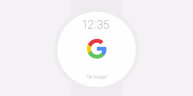
David: Screens are getting smaller, especially once products like the Apple Watch gain more momentum of success, once they work out some of their flaws (another article in itself). And the smaller the screens, the more we lose the nuance of serifs, with their finer edges getting lost. The age of the static logo is done and Google’s departure of the serif lets the logo take on a flexibility to to show you how, across platforms and devices, the logo is alive and working for you.
As part of the rebrand, Google crafted their own typeface, Product Sans. Is this significant?
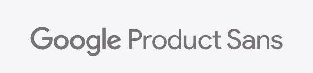
Zipeng: I am all about custom typeface for identity and Product Sans is nicely done but I wish it just has a bit more character and the default lowercase “a” is really not my fav. There’s clearly a lot of thoughts put into this, if you look into the glyph palette, the “G” logo and “Google” logo are both included for it to appear nicely in text and I love the alternative numbers.
Jason: I appreciate when a brand puts forth extra effort to define itself in the most unique ways possible. Product Sans is an extension of that effort. It is significant in that it exemplifies Google’s emphasis on design for purpose.
Corey: If I were Google, I would make a new everything too. Why not, its Google.
David: The only significance I see here is the blow to the typography world when a behemoth like Google cosigns on the homogenization of typeface. While I appreciate Google’s explanation of their typeface as being “built on the mathematical purity of geometrical circles,” it’s really just another sans serif. I’m concerned that in this “sans serif” world, branding and typography might start losing personality for the sake of integration and flexibility. I guess it’s the risk of moving forward, with the hope that we all don’t get watered down.
Google’s introduced a fair amount of animation into their new look, from the rapidly revealing logotype to the dots that move like sound waves when you’re making a voice request. Is this sustainable to keep doing, or does it add to distraction on an already-busy screen?
![]()
Zipeng: I think all the animations and the icons are the star of this identity, they connect the whole identity together and these are super nicely executed.
Jason: As a motion designer, it is refreshing to see companies expand the depth of their brands through animation. With motion, the brand has the ability to become more than just a logo. We’re seeing a whole new side of Google’s personality that is delightful and simple, yet extremely intelligent. I love the pacing and fluidity in the animations they have showcased. I may or may not have stepped through each of the videos frame by frame several times – it IS the highest form of flattery from a motion designer. +1 Google!
Corey: Ahh see dots. Smoke and mirrors. This will appeal to a younger audience and get them hooked even more. My generation is hooked because what else are we going to use, Bing? But it gives motion designers a new outlet and I am sure other companies will jump on this type of branding so thats awesome for them. Plus, it just shows that brands are not gearing themselves towards print good, were cruising fast into the digital world more and more.
David: This is where I see purpose and balance for Google’s redesign. The animation gives the logo new life and functionality across all their products and platforms. While I might argue some loss of classic branding personality, this is a cleaner design which is built for animation and does not distract.
How do you see this identity evolving over time?
Zipeng: I can see this lives on, as long as this is not merging with their Material Design, I think everything will be good! I’m looking forward to see the new doodles!
Jason: Google has defined it’s brand in a way that will allow it to continuously evolve with the times. This rebrand is perfect in its simplicity. Google’s self imposed brand standards have allowed the company to grow tremendously while staying true to its core identity.
Corey: The animations will take over and become the focus, with he branding taking a huge back seat.
David: The foundation of this identity is pared down, an empty canvass. The physicality of the logo might be boring but it’s built to last. Google can take this wherever they like, especially with animated components, new platforms and new products. I’m just hoping that this very expected redesign of the physical logo will bring on many unexpected initiatives in the future.
Rate this rebrand from 1 (I love serifs, everyone love serifs, you’re an idiot if you prefer this new trash) — 10 (it’s about time they moved into the modern age)
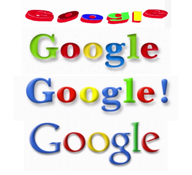
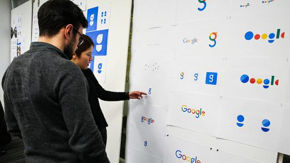
Zipeng: 7.5 Def not my fav nor my least favorite. But I don’t think we should judge this identity by if this is the coolest new thing, for a company this big they must went through endless shit to get this logo out in the world, I’m sure they have killed lots of awesome logos and concepts. (See below) I think this works, and it’ s working well especially on mobile.
Jason: Every aspect of this rebrand is purposeful and I think it does nothing but enhance Google’s brand identity. I give it a solid 8. If I was still on Google+ I might have even given it a +1, but no one would have seen it anyway.
Corey: 7 because I don’t think the new branding logo is their strong point or particularly bad either. It’s just a simple san serif typed out in some primaryish colors, but I think the animations and google doodles is the future of this company.
David: I give this rebrand a 6. I want to ride the fence of 5 for the sentimental loss of the serif, but the businessman in me understands the direction they need to take. RIP, serif.